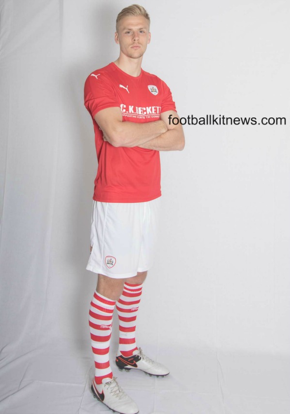
This is the new Barnsley kit 2016/17, Barnsley FC’s new home strip for the upcoming league season. Made by Puma, the new Barnsley top was officially unveiled on May 21, 2016 ahead of the club’s League One playoff final against Millwall at Wembley.
Barnsley finished 6th in the 2015/16 League One season, but beat third place Walsall 6-1 on aggregate over both legs in their playoff semifinal.
The shirt is predominantly red and will be paired with white shorts. Sponsors include CK Beckett, Palmer and Bapp For Bolts
The 2016/17 season will mark the 20th anniversary of Barnsley’s 1996/97 promotion season (they were promoted to the Premier League in 1997) and the club have gone with hooped white and red socks as a nod to that period.


It’s basic but better than being over complicated and looking stupid
Appalling ?
Its red.
Like the last dozen or so Barnsley kits, there’s nothing wrong with it, and nothing interesting about it. Solid five out of ten.
Too generic for god sake but its decent
Also like the socks
Well, they need shirts to play. So they got that going for them, it’s a shirt.
Maybe….. they need more white.
It’s red, with white shorts. Looks better in the flesh with the stripe on the sleeve.
Not sure how you can call it appalling. Quality classic Barnsley kit with no fuss.
Wait Wait Wait, If they get into the championship they’re wearing this? I know the championship is only the 2nd division of english football, but you see teams just getting read shirts do you?
@FAI football association Ireland
*don’t see
Training shirt
Training shorts
Where’s Wally? socks
Oh, my ..
Ps
Barnsley fans – what they lack in good looks, they make up for in friendliness & humorous banter ???
A little white trim on the shirt would improve this kit a lot. As it is, it looks like a red t-shirt. But I like the socks, though.
I prefer this to having that stupid colour accent on the shoulders, a great effort from Barnsley & good luck in the final at the weekend coming up.
…could be Boro!!
As a Dagenham fan, I’m not exactly in.a position to criticize other teams kits. However, it’s really disappointing to see Puma sit on the fence here with the most unimaginative, lifeless kit – especially as Barnsley could be a Championship side next campaign.
I actually kind of like the simplicity of it
Yawn, boring.
Where’s Wally?
Aren’t virtually all kits generic… especially puma and the worst Nike. I think bfc should use the original badge of 1978 to 84ish shirt. the white Rose or bmbc badge lacks soul.. bring the old original logo back .. away shirt should be white and black ..but loved that 97 season white green effort
yawn 2.0 lol@Derby
I love its simplicity. Says exactly what Barnsley is. A no nonsense…proper football club. The socks just add a bit of fun to it all. Ten out of ten…