This is the new Watford kit 2013/14, Watford FC’s new home shirt for the forthcoming 2013/14 season. Watford’s new kit has been made by Puma and the Hornets, who narrowly missed out on promotion after losing the playoff final to Crystal Palace, will be hoping to taste success this season
Watford’s new home shirt was released on the official Youtube channel of new sponsors 138.com, who take over from Sports Interactive ( Watford had Football Manager on their jerseys last year).
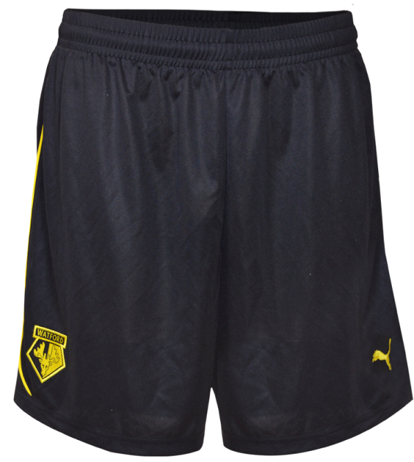
There’s also a change in the club crest, as the pics and the video below will tell you.
Edit- 7 June 2.30 pm BST– four new pics showing kit in greater detail added after official unveiling by Watford.


See more 2013/14 Championship club kits and Kappa shirts


The Chinese (?) characters on the shirt look weird. But like with Aston Villa and Genting, we’ll get used to it I suppose.
Miss FM though.
Same template as Airdrieonians away kit for the season…that’s saying something considering they’re in the 3rd tier of scottish football and watford should be challenging for the championship…
Well thanks promotional video for just showing half the shirt. Plus Watford will have 12 registered players at the start of next season and are under transfer embargo. And Vydras not coming back. Good luck
@JonLCFC
Bitter much?
Find it weird the difference between Premier League jerseys and lower league jerseys.
Had they beaten Palace, I just can’t see that being a kit that would be in the Premier League.
Hahahahahaha yes 🙁 But in all seriousness without the loan players and with the new football league rules your screwed. You must admit it was strangling the famed Watford youth academy with all those foreign imports
@JonLCFC
foxes never quit, whinging.
Nice kit. Really like it. its defferent and good use of black
too much black on the shirt for me , sorry
It is ugly with way to much black. At least we don’t have a massively used template like last year. Please have decent GK and away shirts.
With a promotional video like that who cares what the kit looks like
Much better than last seasons
Yeah. Go Crystal Palace!
It looks well cool
Sad sorry leicster supporters check your facts out regarding the embargo we can still sign players and any we sign will be better than that choker Knocaert HA HA
That is disgusting
if the badge had a “bit” of colour in it would have been a cracking kit.
i like thia kit its smart i like the cloure
Another team sponsored by some dodgy scammy betting company. They should just rename the entire football league to the “Bet718 poker casino wonga League”
Changing the original colours of the badge is terrible, I hate it. And they did it with both jerseys…
@Queggy Sporag
Wonga is a steali…Sorry, a money borrower company
Looks very Asian… it’s unique in the league which is good.