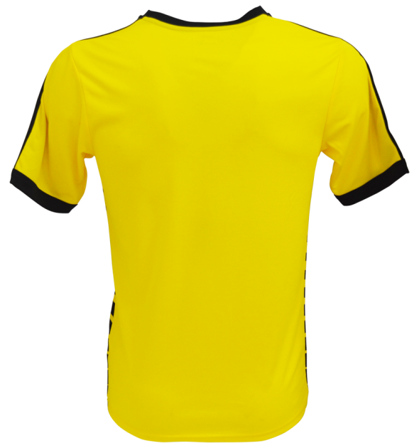
This is the new Watford home shirt 2015/16, newly promoted Premier League club Watford’s new strip for the upcoming season. The Hornets will be donning this new Puma made kit against the likes of Arsenal, Chelsea, Liverpool, Man City, Spurs and Manchester United at Vicarage Road in the 15/16 season.
Watford clinched one of the two automatic promotion spots from the Championship in 2014/15 along with Bournemouth
Shop for the Watford home jersey at well known US merchants World Soccer Shop

Check out other Premier League kits for 15/16 and more Puma shirt designs


Gross.
That is farking awful
Suits their nickname I think. Not bad from Puma, decent effort.
I’m seeing more designers getting obsessed with stripes.
As a watford fan I have to agree this is awful. Perhaps the shirt on its own is ok but the shorts and socks make it look awful.
well, I think it’s great.
I love it! Perhaps incorpate the red a bit more but the shirt itself is lovely.
I like the shirt if they weren’t so over on the black on the shorts and socks. With so much black on the shirt surely red shorts and yellow socks would have helped the balance? Thoughts?
That’s shocking…..pretty dam awfull.
It’s a grower. Gets better every time I see it! A worthy premier league kit.
Terrible
This kit is so 80’s it will match the clubs results of that decade and next season will just vanish back into a lower division. “v” necks never look cool, and shirts must have collars. Ask Eric Cantona.
Erm…You mean the 80’s where they finished second in the top division and runners up in the FA cup? I think they might just settle for that!
Looks like a Celtic away kit to me its hard on the eyes.
Not Bad. Not bad at all.
believe me, its not look like 2015 chelsea kit (at all) .
Great blending in of logo and both club and sponsor colours.
The shorts are pulled up pretty high on those dummies.. look much better in the player shots. I think this is a bit of a ‘marmite’ kit.. but it seems to grow on people after they’ve seen it a few times.
barcode
Looks like a rejected Dortmund design.
I don’t know what all the fuss is about, i really like this , if only for the fact that nobody else will look like it.
sure the socks are “bog standard” puma design, straight off the shelf but the shirt is a “Bobby Dazzler” ! !
stepping onto the top shelf with a bit of style, aren’t we Watford? the sponsor logo is the only flaw i can find.
Excellent
Watford made books?
Very Bold….Won’t be for everyone but I like it…lack of red is a disappointing but otherwise nice 8.5/10
It’s great
Very nice and creative from Puma