As we all know, Premier League giants Manchester United will be switching to Adidas from Nike beginning 2015/16 after inking a deal worth £75m/per season.
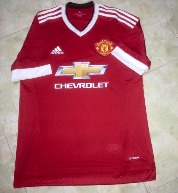
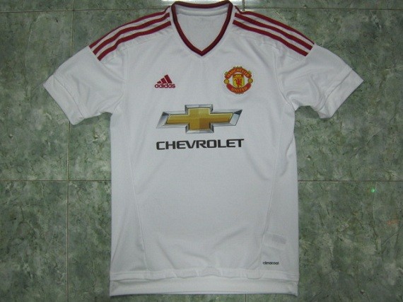
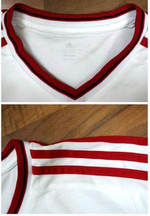
The first pics of what could be Man Utd’s new Adidas shirt for 2015/16 and sponsored by Chevrolet have been leaked onto the internet. They may or may not be 100% accurate (more likely to be prototypes created by manufacturers in the Far East), but that’s something we will know when the kits are officially unveiled.
These pics may miss out on intricate details within the kit, but basically give a rough idea regarding colour scheme and design.
Away kit is white and red, and home is similar to the away, and reportedly has the colours reversed. The third jersey is black. The home goalkeeper shirt is expected to be green, with the away goalkeeper shirt to be yellow and dark grey.


Edit- this one below has been confirmed to be a fake


Uh oh…..
not bad.
I quite like it, very 90s. But ruined by that ugly Chevrolet sponsor.
What the hell…
very baaaaaaaadddddddd
That shirt design will look awesome when complete and worn on match day – the side panels will be fitted, and won’t look as garish. The design is very late 80’s – 1990 era.
But then there is that appalling sponsor. Why can’t all sponsor logos just be monotone on football shirts? It’s not like they can be confused with anything else. Chevy could just do this amazon(dot)com/Chevy-Logo-Cutz-Window-Decal/dp/B0002NIH82
Oh nooooooooo!!!
Sorry, Imma die hard United fan and I have to say if this jersey is damn so awful and disgusting.
I think adidas should better have design for it. if I may suggest, you can get some inspirations from this following 70s home kit (link on below) with pure white neck and sleeve’s end, and of course add the adidas main characteristic which is white colored stripes on the arm side, and also the main sponsored chevrolet at the front, I think that will be cool enough.
cdn(dot)iofferphoto(dot)com/img/item/175/077/119/1973-manchester-united-retro-shirt-ccab1(dot)jpg
if the white rib panels were a darker shade of red and it was a tighter fighting top like the current nike range i would realy go for this top .im sure ive got a greece national side from about 2004 that looks very similar except its blue good effort
Is this an American Football kit? Actually Rooney should be made to wear a helmet. Munter.
I guess Adidas have to do something because an all red kit with white trim and the adidas stripes will always make me think Liverpool and I imagine that’s something Man Utd would be keen to avoid.
you’ll all end up lovin it after 5 games ^^^ hahhaahah
I’m a Liverpool fan this is an awesome kit very nice
@Russel1311
What ruins it is the club with which it’s affiliated.
The fake home kit is horribly overcomplicated, neither of the change strips wow me. Both 7/10
We need a blue kit and the design of the shirt needs to be a tighter fit so that it doesn’t create drag when the player runs.
These kits look so much better, take a look everybody. youtube(dot)com/watch?v=K1AXiPnugQY
NOT BAAAAAADDDDDDDDD.I LIKE THE JERSEYS
Should of let Nike make it shite
The shadow pattern in the black kit is the same as the 92 “Madchester” away kit. I think that one is very real. Not sure about the home and away