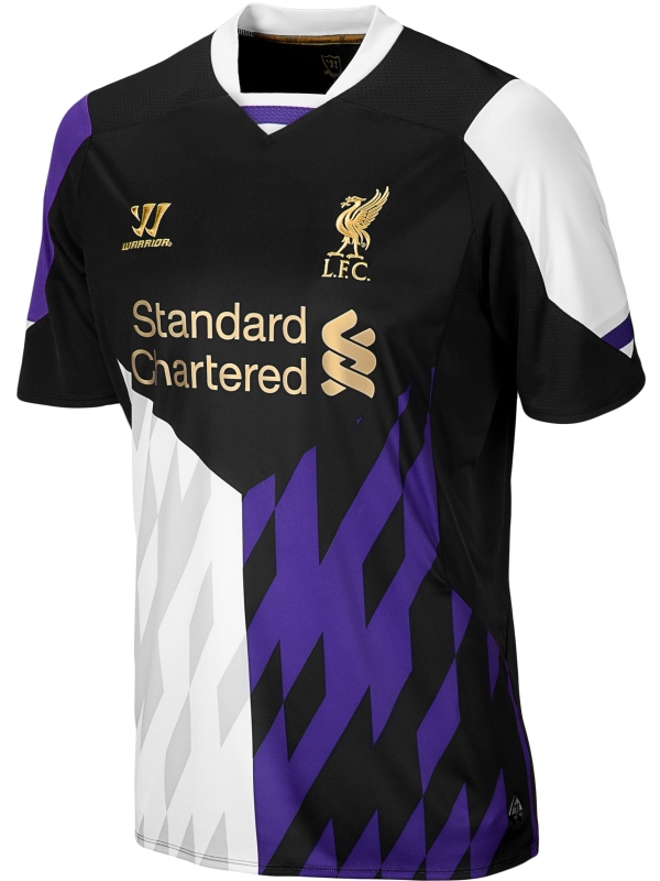
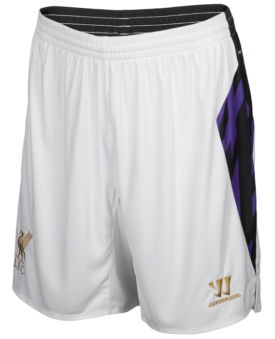
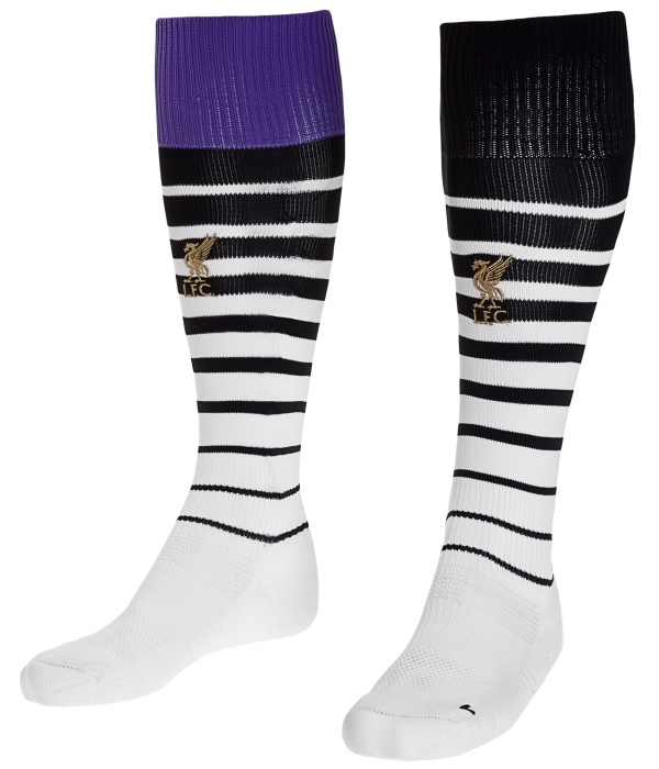
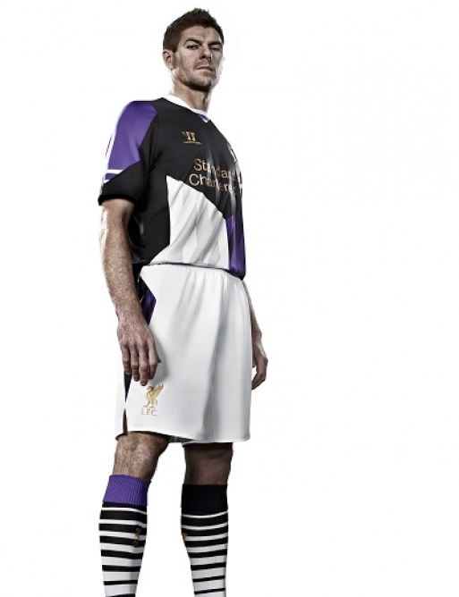
This is the new Liverpool third kit 2013/14, LFC’s new third strip for the forthcoming 2013/2014 Premier League season. This new LFC kit has been made by Warrior Sports and was officially unveiled on 3rd July, 2013. The club have already released their new home and away and this third kit completes the club’s list of releases for the new season
Steven Gerrard, Glen Johnson and Daniel Sturridge are here seen modelling the new LFC second alternate kit, which is predominantly purple with black and white trim.
Goalkeepers Pepe Reina and Simon Mignolet will have an orange shirt as their third kit, as can be seen in the pics below.
See more new Premier League club uniforms for 2013/14



The only thing good about this shirt’s is that it’s better than the ghastly away kit.
Also, mismatched socks? 😛
oh god. the top of the socks are not even the same colour. Disaster. Really dont like this kit :/ Orange GK kit is not bad though
White bit at bottom should be purple like other side and should be purple socks not miss-match. Otherwise a nice kit and I love the orange goalie kit.
What are they thinking? Seriously! After the away kit you would have thought they learned their lesson!
Still have stupid pattern at the bottom of the shirt
Not sure how long Stevie G’s got left @ Anfield but at this rate, he will have seen a number of horrible kits in his career !
Why does everyone hate it just because its different? but everyone likes nikes kit because theyre safe and boring???
I dont ind it, its really nice imaginative design. Warrior good job.
Absolute garbage…seems Warrior don’t know the meaning of the word ‘tradition’. I’d be gutted no longer having Adidas if I were a Liverpool fan.
Errr, does it come with a skull cap with tassels and bells too? Because the first thing that comes to my mind when I see this is the court jester.
We can only wish this will never be worn. Thing is the away kit is a graphic abomination as well. What a joke. Go home warrior.
Horrible!!!!!!
this has to be a joke. these kits are horrible. just plain awful.
This can only be designed by a clown, oh my Liverpool why, did the board accepted this. Our second kit resembles Space invaders and this one its like the left overs. Im missing Adidas already!
OMG ITS AWFUL SHOULDVE STAYED WITH ADIDAS!!!
I sometimes wonder if Warrior’s Liverpool change strips are part of some sort of social experiment they’re conducting.
Lets calm down once we get used to them they will be fine
Hahahahahahahahahahahahahaha
Thank @**k I don’t support Liverpool. The socks don’t even match lol that’s an error when you do that n no one notices never mind runnin about on a pitch.
I know I’m an Everton fan …. but this kit is seriously repugnant
I have absolutely nothing positive to say about this kit… and I won’t say anything negative as the pictures speak for themselves
now, now, this is totally horrible, an eyesore….the socks dont even MATCH!!!! 25 million per year right??
adidas was WAY WAY WAY better….thats the result of choosing money over class
guys its doesn’t matter bout the kit as long as the badge is on it ross carmichael omagh 04/07/13
WTF? I’m not saying anything about that thing other than that the gk kit looks good.
Spectacular , even funnier than the away kit ! The thing with the socks is that you can be sure that some of the players will wear them on the wrong foot so that some will have purple on the right leg and some on the left leg. Even if they put “R” & “L” on the socks, they’ll still mess it up , BRILLIANT !
This makes there last third kit look amazing
Hahahhaha! This made me lol
I actually like this kit, because it’s MENTAL
Combination of colours is awesome! Purple, black, gold, white. Nice.
But, that pattern… No.
Socks are cool, very original.
This has to be some kind of sabotage from other EPL clubs. This is has to be inttentional no way a kit designer can look at this kit and say job well done, no way its impossible. The way i see it this has to sabotage, wow this is a joke
O H . G O D . W H Y ! ! !
Anyone notice how Stevey G’s face looks superimposed or edited onto the shoot? Maybe he refused to model it. Not surprised…
WORST KIT EVER!
Warrior/Liverpool: Please take notes from Adidas (especially with the new Benfica kit), and step up your [design] game. Isn’t part of your strategy to make money off selling merchandise?
Sturridge can’t even look at the camera1 Safe to say I’ll only be getting the home one and I own last seasons third kit!
socks are a recipe for disaster some players will have purple on the left and others the right
oh god, what is warrior thinking??? liverpool better get a new kitsponsor because warrior make the ugliest kits ever..who will buy this crap. liverpool only make loss in kitsales this way
this dont look like a footballkit…looks so cheap
If you really love Liverpool FC you will not buy this s***
Me likey, very original, apart from the socks cause they are stupid. Way better than a nike template..
The home kit was actually OK, but the away kit was a disaster, and the socks for the third don’t even match. It seems as if Warrior is new to the concept of designing kits.
Go home WARRIOR. You’re DRUNK.
shocker………………something a jocky at Aintree should wear!
Well at least they won’t be shoplifted, ha ha ha……
Love it…this should be the main away kit !
@Buzbu
it will be when they play stoke as they cant wear a red home jersey or that white abomination. pure laughing stock…
too much pattern in it…. :X
Well, Liverpool will win the “worst-looking kits” title for the 2013/14 season with their Space Invaders themed away shirts, if there is such an award.
looks like a early-mid 90’s disaster
it looks like a this must be one of the worst kits that have ever been made can only see people with bad eyesight buying this disgrace of a shirt why purple anyway looks like a firework ……
Who the (&*k are warrior, just stay with adidas you stupid club
It is such a tricky kit to pull off on the field. too much light and dark color all at once