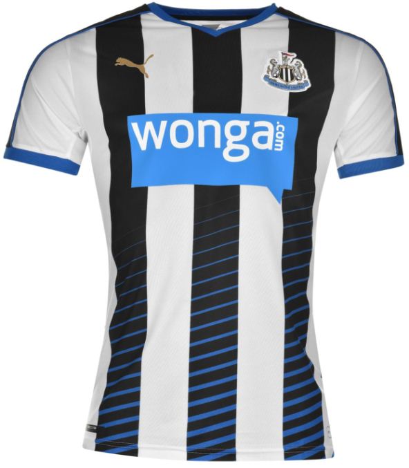
This is the new Newcastle United home kit 2015/16, NUFC’s home shirt for the upcoming League season. The Magpies’ Premier League status is not yet confirmed, with supporters facing an anxious wait this weekend to see whether their side stays up. Made by Puma, the new NUFC home strip was officially unveiled on May 19, 2015.
The home shirt features black and white stripes. There’s also blue in the black stripes (or are they white and gold?). Wonga again remain principal shirt sponsors, and while the payday loan lender have just changed their logo, that change has not been incorporated into these shirts.
Buy the Newcastle home shirt today at reputed retailers Kitbag
Or shop for it online at well known US merchants World Soccer Shop
The release of this NUFC kit matches that of the the leaks shown earlier on this site


![]()


Oh weird! White back is very strange.
thats awful.
There isn’t much you can do with stripes,but I really like how they add the blue to it. Its a nice kit, hopefully that isn’t the away.
Not a fan of that. Far too busy.
Poor stuff.
‘That isn’t the away’????
Shame Newcastle have a payday loan company as sponsors, just feels wrong somehow. Still let’s hope season they give it 1119%
Haha, shows the lack of communication between Wonga and NUFC.
Very sad that the sponsor’s colour scheme is slowly taking over the kit. Still, it’s much better than last season’s ill-fitting, terribly designed headache
Bargain basement again from Puma; wonder if there was any design input from the best coach in the EPL ?
Just to mutch going on for a Newcastle United home to far to busy for my lkeing but the concept could work ok for an away kit for a diffrent club say Arsenal.
I know, When I clicked on it they had the leaked away kit on this page also.
What can I say apart from YUCK! Too much white, the sponsor logo dominating the kit and of course no guarantee that the team will remain in the English Premier League. Let’s just hope they don’t charge 1509% interest if you buy the shirt on credit!
Also forgot to mention………….. It’s the OLD SPONSORS LOGO!
I don’t understand all this hate. it’s a lovely kit
woof
launched tues already out of date due to the logo lol
Not as bad as last seasons effort…..but again poor effort from puma.
I completely agree. I love this added blue to the black stripes. Although the back of the top would look much better black. 8.4/10
All the new Puma kits have a weird fit. I can’t get behind any of their kits. I kinda like the addition of the blue to the stripes.
Given recent performance you can see why they think their colours are now black and blue.
i like the blue on the stripes, but as i scroll down, it felt like an office tie.
@Merry Christmas
for me, it looks ok, but the BLUE in the back is not ok,it doesn’t felt like the Toons.
The all white back is rubbish, front incorporating blue is quite nice though – 5.5/10
C’mon people do none of you have any taste at all? This kit is amazing! Really nice design and I like the blue as well