This is the new Socceroos away kit 2014, the Australian national football team’s new change strip for the forthcoming 2014 World Cup in Brazil. The new Australia change strip WC 2014 has been made by Nike and was officially unveiled on 2 April, 2014 (midnight AEDT)
The kit is obsidian blue in colour and is here seen modelled by Tom Rogic and Mark Milligan in the pics below.
Australia also wore blue away kits in their 2006 and 2010 World Cup campaigns.


simple, crisp and very smart, which is always a big plus for me – but rather bland compared to some of the releases preceding it, such as the Netherlands away strip.
Like creosote above says, bland.
Very much like the home jersey. Not bad by itself, but would’ve expected something better after having seen the home jersey.
Mediocre. White shorts might have set it off.
@Derby
Creosote would also like to note that in their case, ‘bland’ was only used on a comparative basis. :p
i do agree, to some extent – though overall my personal stance is a great deal more complimentary in tone, and i hope that doesn’t get overly misconstrued.
@Sean
i wasn’t surprised by what i saw when these were announced. but i think they could have been much, much worse… i still want to believe that it would take a remarkable level of talent to come up with anything as ghastly as Liverpool’s calamitous purpletini outfit!
nice
Creosote: This is keeping in line with the 1974 40th anniversary strips as per the home strip.
I do agree with your sentiments though and sure future releases will be back to more current design
I have to say that of all the World Cup kits I’ve seen thus far, the Australian kits are by far the classiest. I love the throwback collars and the slightly oversized simplified badge. Bonzer!!
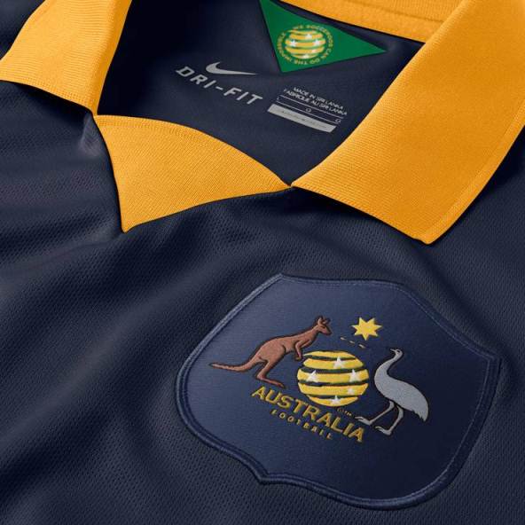
but…theres two type of nation crest? which one they’ll use?
@eryc
The team will wear the shirt with the national coat of arms. IIRC, by Australian law, the national coat of arms cannot be used on an article of clothing that is sold to the public. Therefore, on the replica jerseys, they either deface the coat of arms (by superimposing the Federation logo) or just by replacing the coat of arms with the Federation logo).
Nothing spesh, pretty boring tbh
@DJ
Interesting, you learn something different everyday!
I’ve always hated the Australian national team and this is a prime example of why. Can’t wait to see them get hammered at the world cup
Really good kit
@big ben
wait a second.. you hate them because of their kit? seriously?
like the “retro” mid 70,s collar design………….again simple- less is more!
Come on be honest. If they made it more complicated they would have messed it up.
My personal opinion: Beautifull! The colour scheme is A+
@DJ
Thats a stupid rule. So you can’t buy an exact replica?