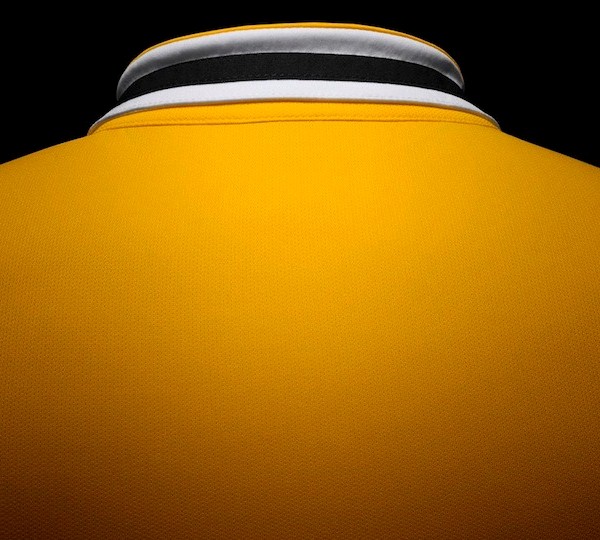
This is the new Juventus away kit 2013/14, Juve’s new change strip for the forthcoming 13/14 Serie A campaign. The new Juve away shirt has been made by Nike and was officially unveiled on July 10, 2013 by the Bianconeri. Like Arsenal who unveiled their Nike away kit yesterday, Juve have also opted for a yellow and blue combo
Andrea Pirlo and his team mates are here seen modelling the new Juventus away kit 2013/2014.


Nice ….
I thought black last year and pink year before that looked better than this.
Nothing against yellow and blue as a combo, but it is too great a reminder of Brazil/Sweden.
For Arsenal, it primarily works because it’s a throwback to their “invinicibles” kit.
Not too sure about the Bianconeri representation of the colour. Looks nice on the sleeves, but the collar seems a bit off.
The reason why they choose the yellow and blue colours, is beacause its the colours of the city of Turin.
Here´s a pic of the city shield: upload(dot)wikimedia(dot)org/wikipedia/commons/thumb/5/51/Turin_coat_of_arms.svg/300px-Turin_coat_of_arms(dot)svg(dot)png
sweden is that you?
@Selle
But the shirts in the past have always been more blue than yellow, haven’t they?
Not a fan! The shorts look so tight on the players. The yellow isn’t a nice bright colour like Dortmund. Just ugly!
*cough cough* Arsenal
Juve had a yellow jersey in 2005-2006, an alternate, with blue shorts.
www(dot)sportslogos(dot)net/logos/view/zemzt02bb8dikm8cehgc40ld1/_Juventus/2005/Alternate_Uniform
The awkward moment when arsenal have the same away kit :/
a bit odd looking with the black & white trim on the shirts but no black or white on the shorts. looks as if they have worn the shorts from a different set of kit ! !
@garbage
A third shirt if I recollect correctly.
I didn’t say they’ve never had yellow, but just said blue seemed to be a more primary colour than yellow.
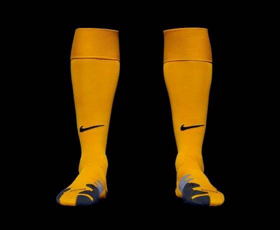
Better than the Arsenal away, nicer collar, no hoops on the socks, a better shade of yellow
Ah, it’s so Brazil! And Arsenal! And Coventry!
@Sean
not always. look this:
encrypted-tbn0(dot)gstatic(dot)com/images?q=tbn:ANd9GcQ9SBYlEocSLVlSP94ePW8ofPdAruBqpss7zowC6Fk_8HFgXFO_
away kit in the early 80’s. same as now. nike did something right for once
third kit 2005-06: www(dot)colours-of-football(dot)com/colours03/ita/juventus/juventus_2(dot)html
would look better with blue socks
classy effort(typical italian),seems to me english clubs are choosing the crap nike templates.
its arsenal….just the sponsor is black colour here….nike just plashing money but out of ideas………
looks cool & nice. but still not as good as Arsenal’s.
…… yellow
Looks similar to arsenal new away shirt
juve the best….
sweden? xd
I don’t usually like Nike shirts but this one is nice.
The color of minions. Haha