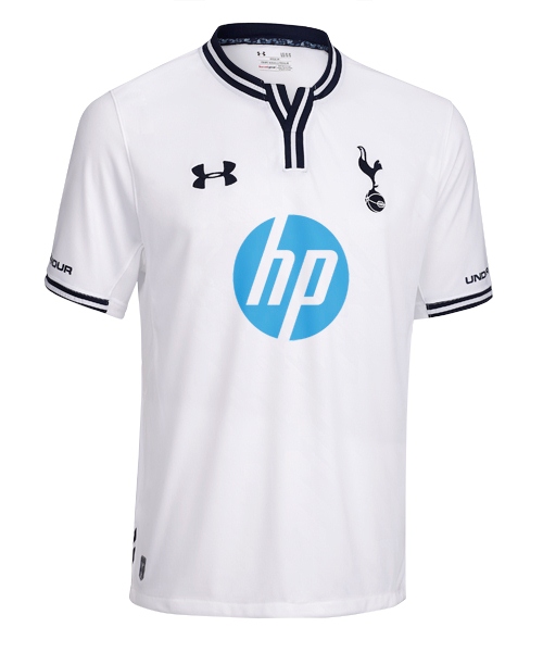
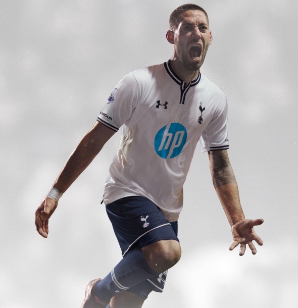
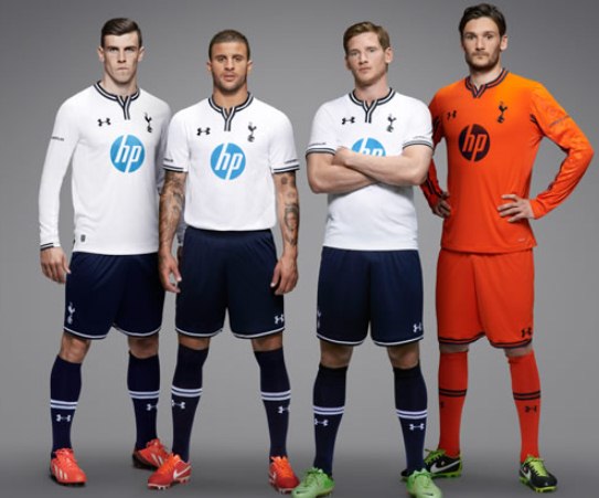
These are the new Spurs kits 2013/14, Tottenham Hotspur’s new home and away tops for the forthcoming Premier League season by Under Armour. The new THFC strips were officially unveiled on July 8, 2013 by the Lilywhites. The new Spurs kits are sponsored by HP, who also own the Aurasma brand that previously appeared on Spurs jerseys
The home kit shorts are apparently “the darkest, deepest blue” to be worn by the club, while the change kit is in “energetic blue”. The home goalkeeper shirt is orange in colour, while the away GK jersey is green, as can be seen in the pics below.
See more new Premier League kits for 2013/14


Great kits, but home would look better if sponsor was navy blue.
nice!!!!!!!!!!!!! home kit is good but not sure about the away one
They did miss a trick by not making the HP logo on the home shirt match with the shorts.
Btw, what exactly is the design on the away shirt?
Not bad, I agree that the HP logo on the home shirt should be navy to match. I like the away shirt, although not too bothered about the pattern, a little bit 80’s wallpaper. Would be nice to see the third to be yellow to fit in with tradition and can’t we have white socks on the home kit? Just looks bottom heavy this way.
I don’t like the home kit neck but the away kit is pretty good
hp log should be navy, but i like the navy socks,looks like the glory glory days kit
Home kit is just perfect and great to see that a former sponsor returns to the club.
agreed on the sponsor colour.
the away kit is simply wrong…
a navy kit would have been stunning
I prefer these ones then last season but I would have kept the same sponsor
I like the away a lot and the goalie jerseys are nice the home is okay but hopefully they get top 4 next season
Nice home shirt!!!
Not a fan of these at all! I thought Puma made the best Spurs kit.
nice home kit,not to impressed with the away to be honest.
Away kit is like marseille’s previous away kit
ohhh, very nice, the away one would look better without that metalic silver triangle crap, maybe a more light blue
Looks good, like the sponsor, the light blue stands out from the kit which I assume is what hp want.
looks like puma template last season. not bad though.
this is why under armour is better than warrior. simplicity at it best.
hmm..i dont like the double lines
very decent home kit
I like what Under Armour did with the home kit – it has an early 60’s meets early 80’s vibe to it. The more I look at it, the light blue HP logo is beginning to gradually blend in, or at least being a welcome 3rd colour in its own right.
The away kit has a very 80’s design. It’s class.
the sponsor looks weird .
the collar are different than other.
gk kit is very nice
Home one’s nice! Away one’s Rubbish! True the sponser on the Home one should of been Navy not Sky blue! Away one look’s like ’92 Home Coventry Kit! Lol. COYS!!!
great kit no red
Yeah I have issues with Spurs using Sky Blue away kits too, but this blue is better. Want the home kit. That works.
under armour, go home
home kit is actually good, but the hp sky blue things is a no for me… would be better if that navy blue ofc.
Away kit is too bright and y don’t use fully navy blue instead of that kind of blue?
Nice kits
overall i like the home kit, however would have preferred if hp logo was navy blue as it stands, the first things that grabs your attention in the design is the sky blue of hp ( which is good for the sponsors) , the socks could have white with the spurs emblem embolden on the white. I still like last season all white strip though.
This kit looks like Europa to me.
Innovative…
Much better than that plastic coated s**** Nike have supplied my team MCFC , this year ! 🙁
Harry Potter from London? I dont like the neck
reminds me of a box of soap powder
planet of the bales
I am a arsenal fan and i like there home one better than arsenal’s home shirt
i like these kits maybe a new kit will bring succses to the club
Home shirt reminds me of an advert for washing powder… load in the hp logo.
Away is tasteless and a really sickly awful shade of blue. Spurs could have done MUCH, MUCH better !!
both are pretty good. home is much better. i’ve had my doubts about UA
I actually quite like this away kit.
I kinda want one and I’m not even a Spuds fan! 😀
@Sean
HP logo is in HP’s corporate colour for those of you wandering why it does not match the traditional Spurs navy
Spurs kit is awesome is always
no 1 thing bale wont be wearing it lol
Great kits, always prefer traditional Navy + White and just want to see the team shine whatever they wear ! Hope UA now do some decent logo’d polo shirts for the fans ? The UA golf shirts have always been quality ! (Did they buy Away kit off Coventry after liquidation !)
where is the third kit, for playing against westbrom, man city, wigan games…..
Looks more like Tech Support team 😛
The away should be navy blue and the HP should be white
wow i like it
Absolutely the WORST home kit in our history! What is that v-neck thing all about..??
Will not be buying this year, will wait till next year for (hopefully) improvement.
Horrible!
2nd kit fab.
Nice home shirt!