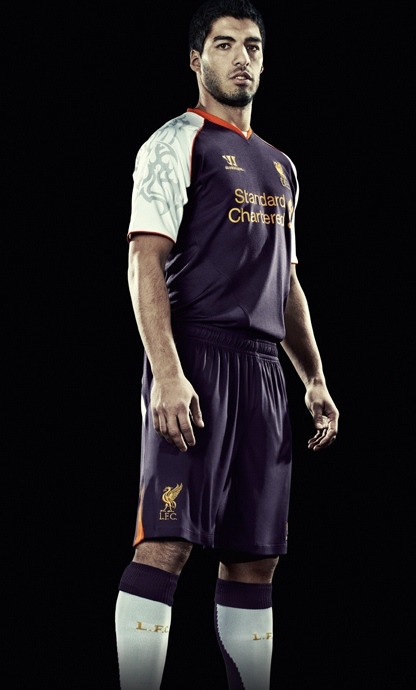
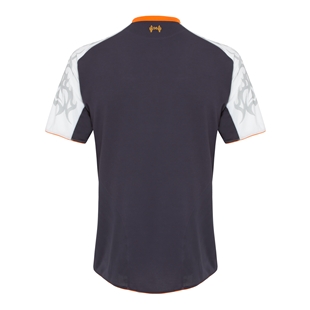
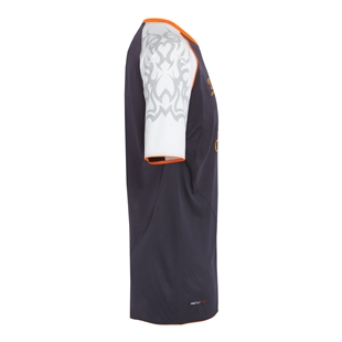
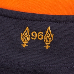
This is Liverpool’s new 2012/13 third kit, Liverpool FC’s new third shirt for the 2012/2013 season. The new LFC third kit 12/13 has been made by Warrior Sports and was officially unveiled by the club on 5th July, 2012. In the words of the club, the new LFC 3rd strip is nightshade, orange and white and takes inspiration from past goalie kits worn by David James in the 1994-95 & 95-96 seasons and Pepe Reina in the 2010/11 season.
Liverpool’s new third kit had been leaked prior to the kit’s official release, and those leaks proved to be correct as the photos below of the kit will tell you. The strip will be mostly used for Europa League games and select Premier League fixtures.
Liverpool, for the record, have already unveiled their new home and away 2012/13 kits.
Strikers Andy Carroll and Luis Suarez are here seen modelling the new Liverpool third kit 12/13.


See other already 2012/13 released Premier League kits here.


doesn’t look that bad- could’ve done w/o the print on the side though
lol andy caroll
does anybody no what the prints for?
This is not an adidas kit. Please update the title!
Oopsie oops, my bad!
Corrected, thanks Rob
Not bad, I like it. Something different is always nice but the sleeve design has an odd approach to it. Nonetheless, puts a bold statement for Liverpool.
ugly geez these are so bad
this is so NFL
ugly what the hell is going on with kits these days. simple is best, what the hell is that tattoo looking shit on the arm
orange, purple, grey- WHAT? i think andy carroll likes the kit
Its real?! HAHAHAHAHA.
Quite nice, home kit looks more like a polo shirt tho
Purple, orange, white, yellow and a bit of grey on the sleeves, this has to be the worst kit this season
I don’t like the colour of the jersey.
I’m a Liverpool fan and I have to say these are absolutely embarrassing
When I saw a leaked photo of this shirt I though someone was taking the p***, but the only people doing that are the designers at warrior sports. If I see anyone in the street wearing it won’t be able to stop myself laughing at them. Poor Liverpool fans!!!!!
Totally American… They make everything look like a faddish item in America… The people of the states have been trained that when a product breaks or a new product comes out that quickly replaces the old one, we don’t demand more out of what we buy… We simply go to the store like the consumer zombies we’ve been trained to be and purchase a new one… This is what you are seeing here… There’s no thought put into this kit because the folks at warrior are trapped in this cycle… This is what happens when you go American… Land of the consumer… Warrior haven’t a clue about football culture, they’ve only been told to produce a shirt… And here it is…
STUPID, warrior, ugly, ugly colour!
not to my taste, but i’m sure many will like its ‘out there’ design, the market a lot third kits seem to be aimed at these days. i like America, despite its foibles, though even some of their own seem not to.
Oh Dear. All of Liverpool’s kits this season are not very good at all.
Worst kit ever
@Mr French
Mr. French stop insulting americans. we arent stupid, and you dont know about us so be quiet.
but u r right about warrior knowing nothing about football (they make lacrosse stuff!)
Thought the whole point of reverting to the old badge was to promote a ‘retro’ look not this…
NFL? More like XFL. LMAO
@Mr French
Thats Absolutley True
I mean About Warrior Sports Being Crap At Making These
(Crap Shirt To Go With A Crap Club)
so funny EVERTON FOREVER
@alexfc17
5 champions leagues, 18 premiership titles, 8 carling cups and 7 fa cups! In your dirty everyone face!
Everton face (sorry)
i saw this and was hoping it wasnt real pile of shit home and away are nice though
A MA ZING 10/10
@abc… Never said Americans are stupid… I happen to be one… A French American, to be exact… Just our ideas of consume, consume, consume, is what has our country in the shape it’s in… Sooner or later, you have to pay the bill!!! And like it or not, THIS IS A S#*T KIT!!! just read what everyone is saying…
The only Liverpool kit this season that doesn’t look like a wetsuit. Still, it’s wank. And they got The Racist Golem and No Goal Carrol to model it. Bad job.
3 Champions League’s 19 prem’s 19 community shields 11 Fa Cups 4 Carling cups 1 European cup winners cup 1 FIFA club world cup 1 intercontinental cup beat that @Oscar
I meant Oscar
suarez looks serious
F00king HIDEOUS!!! The person who “designed” this must have been on acid or something, it beggers belief why anybody would want to wear this abomination. A five year old could have done better job. Oh well, its only Liverpool…
Home kit – 8/10
Away kit – 7/10
Third kit – 4/10
Not the worst kit I ever seen,but wont be paying for it…
I guess I’m one of the few that likes it. Definitely better than the away kits which looks like a wet suit.
crap!
Liverpool kits :
Home kit – 9/10 – Nailed it.
Away kit – 5/10 – WTF !
Third kit – 6/10 – Not bad.
Liverpool Kit ratings
Home: 7/10 quite boring
Away: 4/10 Looks like a wetsuit
Third: 1/10 Worst kit ever
love the home kit but third and away kit are the worst kit im gonna like spurs home jersey better than liverpool away and third kits
lfc home kit de best where the hell is adidas we got warrirs crap
I think the design is nice but the colours are not a good choice
umm… its okaaaay :/
You guys dumped them because Warrior offered significantly more cash.
Good move business wise, but look at the rags they’ve produced for you this season 😛
OK!!!, But I like the orange collar!,
@supersuarez
joke
RARE !!!!!!!!!!!!!!!!!!!!!!!!!!!!!!!!!!!!!!!!!!!!!!!!!!!!!!!!!!!!!!!!!!!!!!!!!!!!!!!!!!!!!!!!!!!!!!!!