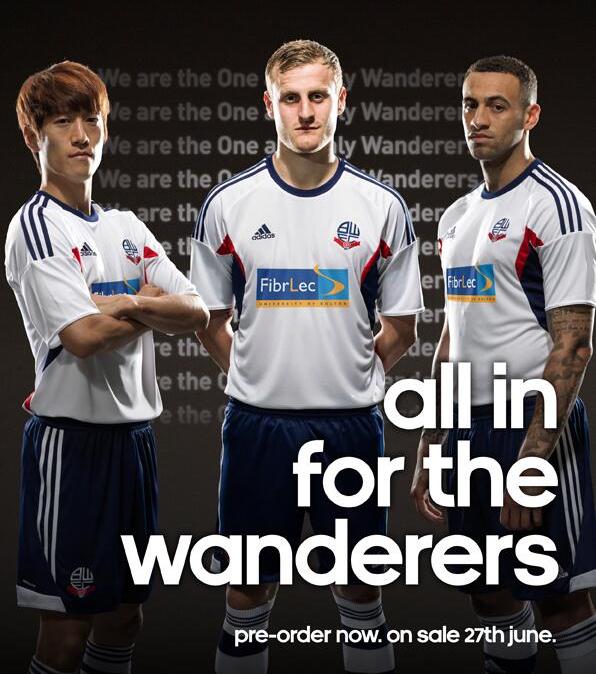
This is the new Bolton kit 2013/14, Bolton Wanderers’ new home kit for the 13/14 Championship season. The Trotters’ new strip has been made by Adidas and was officially unveiled on June 6, 2013. BWFC had originally signed up pay day loan company Quickquid as their sponsors, but following fan protests, scrapped the deal and opted for Fibrlec as sponsors.
Here is the new Bolton home kit with the redesigned crest.


Bolton has the ugliest crest ever. Looks like a 5 yr old made it
Lovely shirts. Adidas are really standing out above the rest as great kit makers this year
Nice kit. Let’s hope we get promotion in it! COYWM!! Also glad that QuickQuid has gone
The Old crest was perhaps better but this new crest isn’t too bad either.
The Kit itself isn’t bad, without the sponsor…
Kits have been substandard since leaving reebok,
Nice kit ruined by very poor sponsor
Sponsor’s colours ruin a decent top
Should have been sponsored by N-Power cos they will be in The Championship for a very long time. 🙂
very nice – even exceed expectations….. @jim, please stop talking nonsense
Me likey.
Even better without loan sharks QQ on the shirt.
Old Bolton crest always reminded me of a sperm.
But yes, sponsor looks just dire on an otherwise nice shirt.
Very nice
@Ian
If you class 1 more season as a long time you may be right!!!!
at last………….Bolton have got rid of that shocking badge………..nice kit to!.
LOVE THE NEW BADGE!….. LOVE THE NEW SHIRT!……GLAD THAT QUICKQUID IS GONE!
David wheater’s career has took off since boro hasn’t it…. square chin
love this kit <3 best weve had for years only one that can compete is the all white one in the times of campo, nolan etc…
Sponsor ruins the whole kit
Common you whites!!!!!!!!!!!!!!
Nice kit, like the crest. At least they have the Lancashire rose back.
Yes, sponsor ruins the kit. But think about it, poor design because the designers should be working around the sponsor. I wont be buying this one
Adidas stuff are the best kits
Yeah the sponsor trashes the kit. The new thing on the badge makes it stand out more which I kinda like.
a lot moaning about the sponsor looking bad, but best sponsor we’ve as for what it stands for, look them up. don’t look that bad though, certainly better than the 188 bet one!!! problem is we’ve been too used to the reebok sponsor in the past which obviously looks good on a top being a sport brand
glad we gone back to the old badge, not exactly like it used to be but near enough. the badge we just got rid of always looked like a balloon floating away!!