Click here to see official pics of the new Man City 12/13 third kit
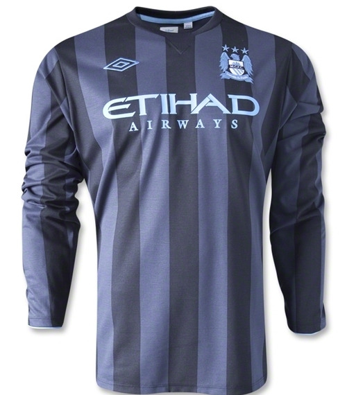
This is what is rumoured to be the new Man City third kit 2012/13, Premier League champions Manchester City’s new European away kit for the 12/13 season. City have already released their 2012/13 season home and away kits, and this 3rd shirt, like the other two, has been made by Umbro.
As always, whether or not this is the new Man City third kit for 2012/13 will only be known when the club officially make their presentation.
The first pic is a leaked one while the second pic is that of the kit as it was on sale at a major online retailer before being pulled down.


Fit for a Shitty Club!!!!
thats a nice combination of colours, even if i would prefer the badge to be its normal colours the colours it has been rendered look very nice on the kit.
Not sure if I like it or not. I still think the badge looks silly when they change the colours etc.
Now.. that was much better than the Home (blue) and away (marron red) jersey
what is with the champions league kits
But that’s gonna clash with the home shirt? wtf!
Ehh….maybe change the colour of the badge to white and also the colour of the sponsor and it will look decent enough.
Looks like last years away but as a negative print
brilliant what is it with the badges there so good
@littlelee-MUFC
its good just say it
ITS FANTASTIC!
Looks superb, just like most of umbro’s kits this season
Terrible!
Average
A bit like inter Milan shirt ………. But it’s OK!!!
I like this a lot. Seems like making the badge blend into the colour pallette is a recent trend for a lot of clubs. Looks pretty decent here – still not too sure about how it works on the new home kit though.
great combination of colour but the template is nothing special
The home shirt is decent, the away kit is great, but I’m sorry to say that this third kit is dreadful. Looks like a Sunday pub team kit, get a grip Umbro
@005
Briiliant !!!……….. nob
lovely kit, nice set of colours which go well on the same top, its as good as last season’s AC Milan away top. If i was a Manchester City fan i would be extremely pleased with the kits Umbro have brought out for the club this season, if a little iffy about the black and white badge on the home kit
Last year they had the AC Milan looking away jersey, this year it is the Inter looking third jersey. Mancini must feel more at home now…
So the top two teams in the Prem are based in Europes dreariest city. God spare me from having to work in that wet, boring, depressing northern dump ever again. If my firm try to send me back to our Mank branch i’ll quit…no joke! (i’m a Hammers fan working in Brighton-take your best shot)
its nice kit but im giving my vanks to umbro they have realy steped up there kit looks lately since that nice new engaland kit in 2010 world cup and they passed that on to the manchester city kit and the wales kit but im not to shaw that rangers had a nice kit with ubro it was very ugly and cheap looking anyway fums up to umbro
to forza juve the red and black stripe kit has been a traditoinal away kit of manchester city for a long time it is nothing to do with mancini so think before you make your coments vankue
after ac milan wanna be, now internazionale milan wanna be?
if you change the umbro logo, badge, and sponsor to white it will really pop
looks nice
if its blue and black ,best city kit ever
The same template as the away kit. Still nice though.
CHAMPIONS 2012 LOSER!
If you’re saying it is the same template as last year’s away kit, then you need to see an optician. Last year’s away kit had a large black part around the collar (stretching to the shoulder near about) and the stripes on the sleeves were vertical, so when a player put his arms up, the lines across the whole shirt were all in the same direction.
the third kit is canna shocking but i love the home kit:)
mcfc FTW
@005
And your dishrag kit is brilliant eh?
Better than that tea towel of a home kit noted have though !
City for the title again , c’mon you blues !
That doesn’t matter as we’ll never be playing in it at home so how can it possible clash? Besides its different colours from the home kit as the home kit is sky blue and this is a lot darker and its striped. A shirt clashes if its the same colour and this isn’t.@Mike
Man City is the Premier League’s best team, Have no doubt about it. I’m proud being a City fan now and will always be. And with such a jersey, we ‘ll tear any team at home and abroad. Etihad forever..
We’re the best. Man City forever…
1) It’s not the same design/template as last year’s away kit. If you think it is, you’re a stupid rag and can’t see. And don’t even use the argument that it’s copying AC or Inter Milan’s jersey just because it has stripes. Teams have been using stripes in every sport for years, get over yourselves.
2) They didn’t change the colors of the badge just to match the jersey. MCFC has 3 different badges they use — the normal color, the blacked out like you see for the home kit, and the blue one that is seen on this kit and the away GK kit.
3) CHAMP16NS (Ouch, that match was a beating! And it was at your home field)