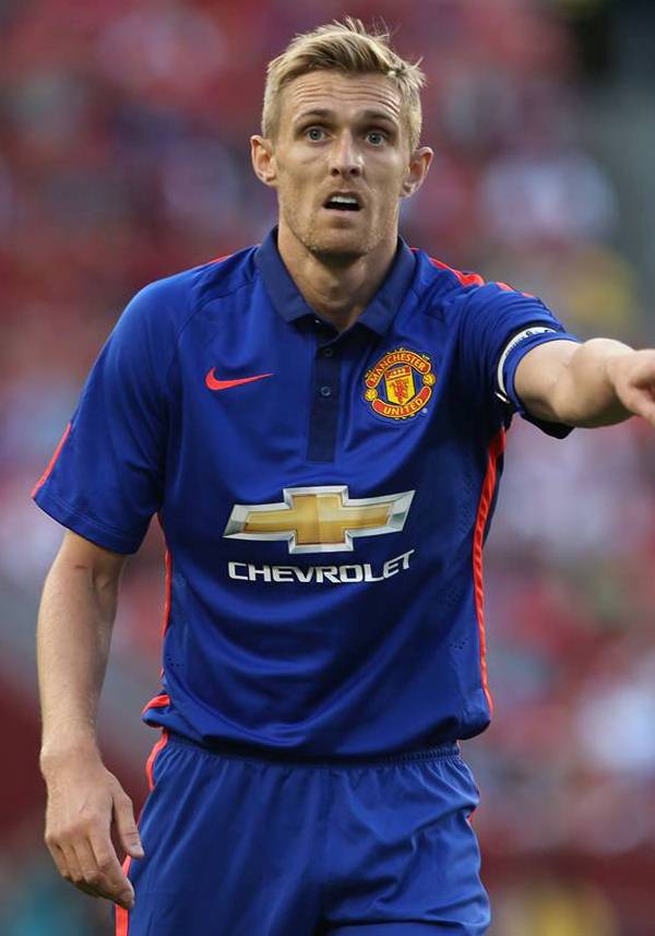
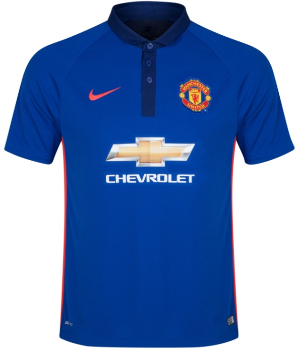
This is the new Manchester United third kit 14/15, Man Utd’s new second alternate strip for the upcoming Premier League season. Made by Nike, the all blue uniform was officially unveiled on 29th July, 2014 and made its debut in United’s pre-season US tour fixture against Inter Milan, which they won on penalties.
Consisting of two tones of blue, the kit is inspired by United’s tradition of blue kits from the 1980s, as well as uniform worn when they became the first English side to win the European Cup in 1968.
The shirt, shorts and socks are all a rich and vibrant blue on the front with a darker tone of the same color on the entire back, as the pics below show. The two tones are divided by a red stripe on both sides of the kit representing United’s famous home color.


The red stripes on the side don’t look right. Looks like a training top
Nice one.
I like this a lot. Looks rich and clean. Probably need to see it in the flesh as I think it’s orange insets and not red. But still impressed
I think this quite nice to be honest. Just don’t like the idea of having a third kit, shameless money grabbing really!
Definitely orange trim and Nike swoosh. This is very nice. Could easily be a Dutch away kit, but is actually better than any blue Dutch away kits I can think of and better than any of Nike’s previous blue efforts for Man Utd.
Teams do have to have 3rd kits if they have red home kit and white and black away kit. What else could Man U wear at Sunderland, Stoke or Southampton? Teams should not wear clashing kits and should minimise clashes in many cases, but should not be too pedantic, for example a team should not wear red against a claret team but should wear black, and a red team should wear red against a yellow team, but not an orange team. Confusion should be minimised, but we cannot be too strict @Moza
that being said, teams should use their last away kit as a 3rd kit for this campaign. Man U in particular usually do that, so a from scratch kit is rediculous. Nike kept us an away kit as a 3rdkit for 2011-12 and 2012-13. That is much easier to do@lh
omg, what a mess! the Netherlands look-alike
The red stripe is too thick and kind of spoils the kit with its crudeness. If it were thinner, lke a pin stripe it might work. Still interested to try the shirt on as it is just so unique..
@Moza
I think teams are required to have a third kit for Eur . . . oh. Sorry.
Best United Shirt for years!
@Carl Haha lol.
I personally don’t mind this kit but every big team team with kits by Nike is going to have a third with the same template and two tone design. PSG is red w/Navy, Barça is neon yellow w/Navy, Juve is lime green w/Navy, and Man City is deep purple w/Lime accents.
Weak overall effort from Nike, I support Arsenal and after seeing Nikes latest kits I’m glad they signed w/Puma.
not bad at least its of a decent quality and finish.
ugh
It’s bull!! A Polo T-shirt at best…all Nike want is MONEY!
Sorry, doesn’t work for me.
Polo shirt, with two different shades.
Minus that Man Utd logo and Chevrolet logo, it looks a bit like India’s Nike cricket shirt.
hate those collars! the orange stripes look awful, would be alot better in white stripes. don’t like the darker navy on the back either. 5/10 would rather have it like away in 02-03
historicalkits(dot)co(dot)ukk/Manchester_United/images/manchester_united_2002-2003-third(dot)gif
By God it’s awful. United are neck and neck with Liverpool for horrible kits year after year. That sponsor is rotten.
Adidas will give them a huge lift next season.
hideous!
Not keen on that flashy orange trim.
tired of blue united shirts, a black away would be better
what is this, 1997?
@Paulie
agreed, fully
Excuse me while I vomit
I actually like it!
Awful