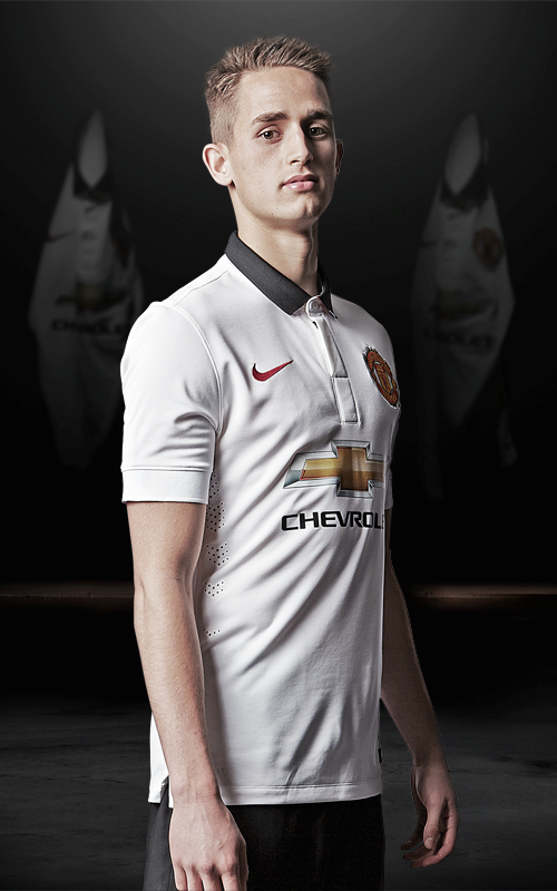
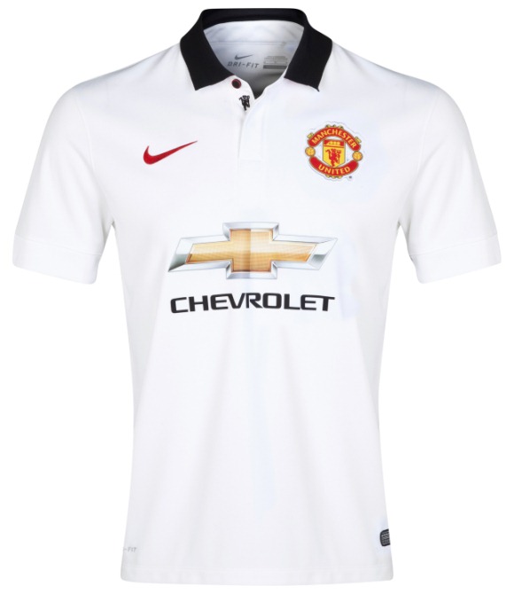
This is the new Man Utd away kit 2014/15, Manchester United’s new alternate strip for the upcoming Premier League season. Made by Nike, the kit was officially unveiled on July 23, 2014, on the eve of their pre-season friendly against LA Galaxy.
The away shirt is white in colour and has black polo neck collar and a unique black button that is engraved with the club’s name.
When the collar is open, it reveals a small black devil from the centre of the club’s crest. On the underside of the collar, one can find a red, white and black stripe, as well as a small label that carries the message “Youth, Courage, Greatness”.
Across the back of the shirt is an engineered mesh in a series of chevrons to replicate the pattern used on United shirts as far back as the early twentieth century – and again in recent times.
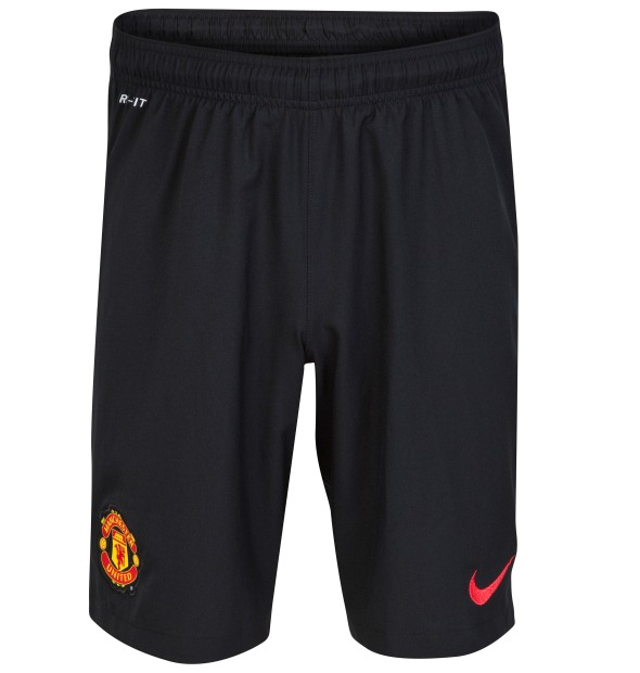
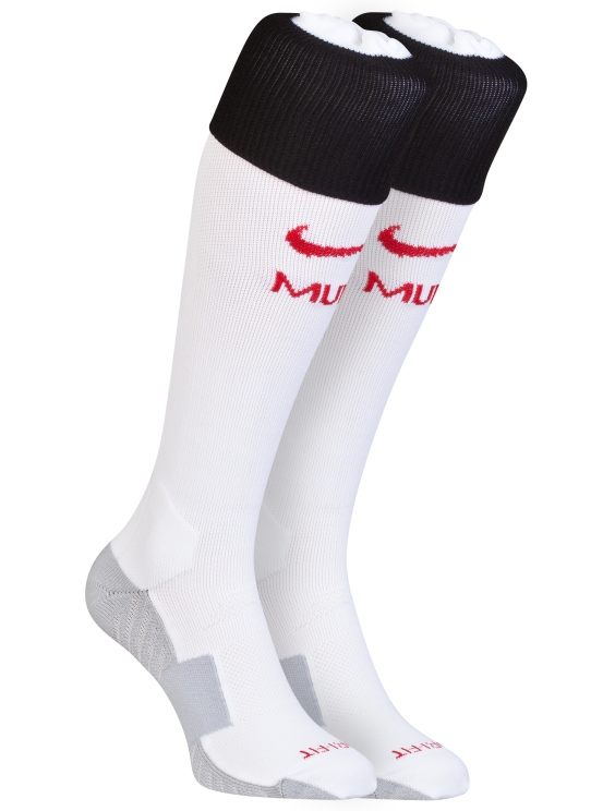
The new away shorts are black, while the socks are predominantly white.
Buy this new away shirt today at well known merchants Kitbag
Or shop for it at reputed US retailers World Soccer Shop


")


Nice kit, sponsor ruins it. What is the Klu Klux Klan doing in the background?
Very nice. Think when adidas take over the shirts will be even better.
Not bad. But Nike aren’t trying very hard, are they?
Uninspiring. Celtic wore a similar template a couple of years ago.
ehhh, it’s mediocre. 6/10
badge seems a bit big. I think Man U’s shirts would look better with just “chevrolet” and not the “+” logo.
Nice and simple. Just have a feeling that Nike phoned in the united shirts this season. Heard the third shirt will be quite interesting. Nike milking the cow one last time.
Horribly bland. Why do we always have white, blue or black away kits? Can’t we break ‘tradition’ for once?
the away is the same as always.
Hahaha!
Agreed re the logo, or if the “+” was in 2 solid colours, e.g. Red and Black. Some companies have no problem altering the colouring in their brand logo a little for advertising purposes (like football kits) – others go by the book exactly.
LOL! The hoodies in the back are hilarious. @James
i love how nike keeps it simple, yet still classy… thanks chevrolet for f***ing it up.
Not a bad shirt but the sponsor does spoil it! The Chevrolet lettered logo on it’s own would be perfect!
Its not bad, plain but its good
I’d like this for the German national team.
that’s a horrible effort – but it was expected of nike cos they are ending this season – they always do that for the last season they make kits – they are so gruesome. welcome Adidas
Makes me want to puke.
Pretty tame effort by nike. Again
same white away as always